Download
1 / 9
90 likes | 97 Views
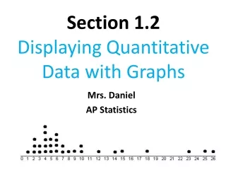
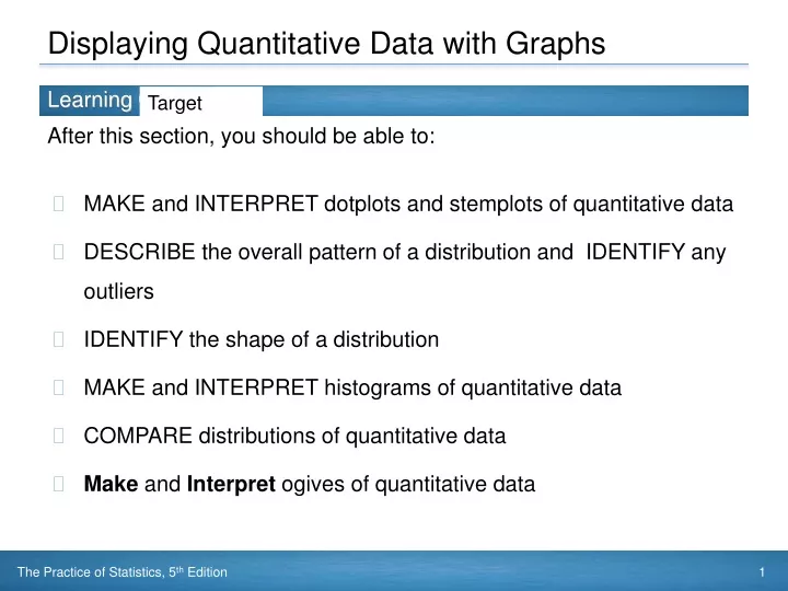
Displaying Quantitative Data with Graphs. Target. MAKE and INTERPRET dotplots and stemplots of quantitative data DESCRIBE the overall pattern of a distribution and IDENTIFY any outliers IDENTIFY the shape of a distribution MAKE and INTERPRET histograms of quantitative data

E N D
Displaying Quantitative Data with Graphs Target • MAKE and INTERPRET dotplots and stemplots of quantitative data • DESCRIBE the overall pattern of a distribution and IDENTIFY any outliers • IDENTIFY the shape of a distribution • MAKE and INTERPRET histograms of quantitative data • COMPARE distributions of quantitative data • Make and Interpret ogives of quantitative data
Brainteaser • What does man love more than life, • fear more then death or mortal strife, • what the poor have the rich require, • and all contented men desire. • What misers spend and spendthrifts save • and all men carry to the grave? • When I'm young I'm tallWhen I'm old I'm shortWhen I'm alive I glowBecause of your breath I dieWhat am I?
Percentile • The pth percentile of a distribution is the value such that p percent of the observations fall at or below it. • Relative is a word used in Statistics that indicates that percents are to be used.
Ogive(Relative cumulative frequency graph) An Ogive tells us the relative standing of an individual observation. • Step 1: Decide on class intervals and make a frequency table, just as in making a histogram. Add three columns to your frequency table: relative frequency, cumulative frequency, and relative cumulative frequency. • Step 2: Label and scale your aces and title your graph. • Step 3: Plot a point corresponding to the relative cumulative frequency in each class interval at the left endpoint of the next class interval.
How to Construct an Ogive • To get the values of relative frequency column, divide the count in each class interval by 43. Multiply by 100 to convert to a percentage. • To fill in the cumulative frequency column, add the counts in the frequency column that fall in or below the current class interval. • For the relative cumulative frequency column, divide the entries in the cumulative frequency column by total number of individuals.
Ogive ExerciseA person at the 80th percentile spent about how much money
Brainteaser • What is the only word in the English language that has 6 letters, all in alphabetical order? • What's another name for table tennis? • Two people are in a barn. Ten cats follow them in. How many feet are in the barn now?
AP Stats Homework • Pg 100 : 9 a,b, 10a,b pg 103: 29