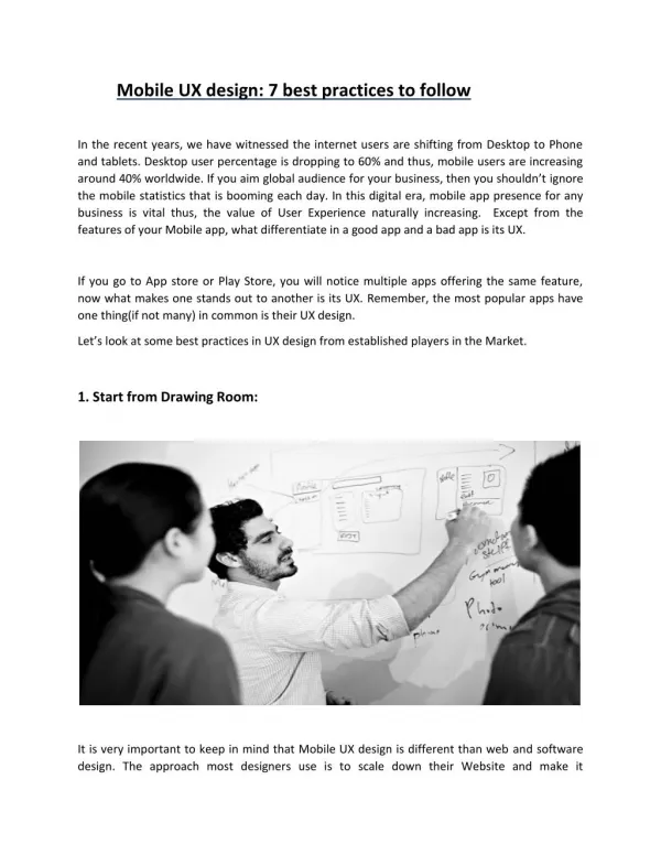
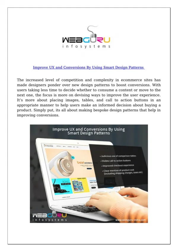
Download
1 / 3
30 likes | 94 Views
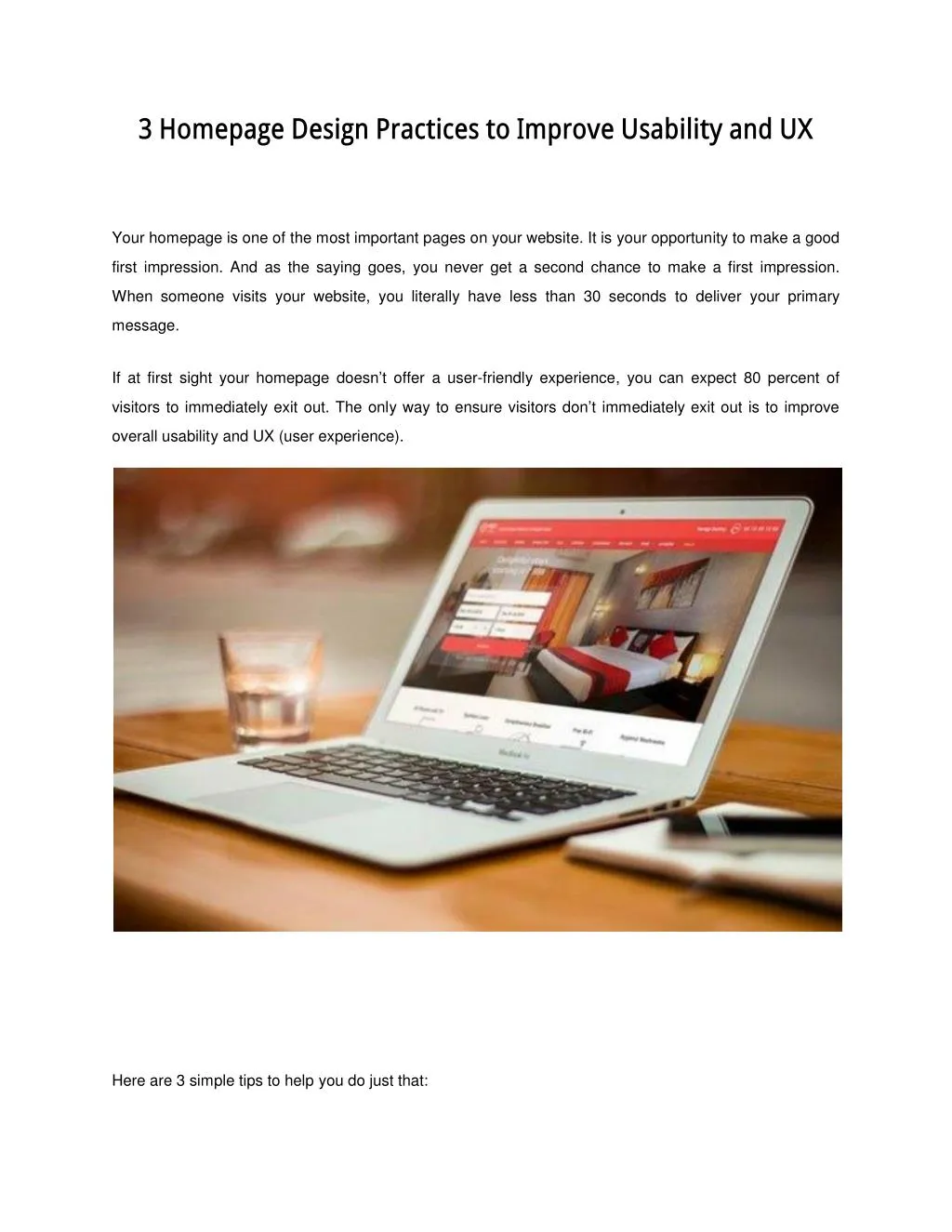
Your homepage is one of the most important pages on your website. It is your opportunity to make a good first impression. And as the saying goes, you never get a second chance to make a first impression. When someone visits your website, you literally have less than 30 seconds to deliver your primary message.

E N D
3 Homepage Design Practices to Improve Usability and UX Your homepage is one of the most important pages on your website. It is your opportunity to make a good first impression. And as the saying goes, you never get a second chance to make a first impression. When someone visits your website, you literally have less than 30 seconds to deliver your primary message. If at first sight your homepage doesn’t offer a user-friendly experience, you can expect 80 percent of visitors to immediately exit out. The only way to ensure visitors don’t immediately exit out is to improve overall usability and UX (user experience). Here are 3 simple tips to help you do just that:
#1 – Keep It Simple One of the things that can completely ruin a homepage is the notion that you must include absolutely everything about your business on this one page. Your homepage is your welcome mat. It should be simple and to the point. If people feel overwhelmed at first site, they won’t stick around for too long. Your homepage should only include the most essential pieces of information. This means an about us section, a products and services section and some sort of list building element. As soon as someone lands on your homepage they should know exactly what your website is about and they should know exactly what you want them to do next. #2 – Make The Page Easily Scannable When the average person visits a website, they quickly scan it to see if it’s worth them exploring it a bit more. If the information isn’t easily scannable, they will move on to the next site. Break down your information into small chunks. Use headlines to your advantage. A visitor should easily be able to see what a section is about based on the headline. Use images and short paragraphs to make the content on your homepage easily consumable. #3 – Have A Clear Call To Action Never make visitors guess what they should do next. Your homepage should not only invite them to stick around, but it should also invite them to take some sort of action. And believe it or not, most users look to see what action they need to take. They are actually expecting you to guide them. Use a clear label so visitors can know exactly what they are doing. For example, if you want visitors to join your mailing list, clearly mark the label and “join now”. As far as call to actions goes, you should keep them to a minimum. You don’t want to have more than two on your homepage. Too many call to actions will only turn visitors off as they will think all you are trying to do is sell, sell, sell versus actually helping them with their problem. Also pay close attention to where you place your call to action. Positioning is everything when it comes to a call to action. If it is in the wrong location you will have a very disappointing conversion rate.
If need be use heat maps to determine the best places for your call to actions.