Download
1 / 4
40 likes | 47 Views
Designers should improve the user experience in ecommerce sites to get a better conversion rate. Here, the use of comparison tables etc becomes important.

E N D
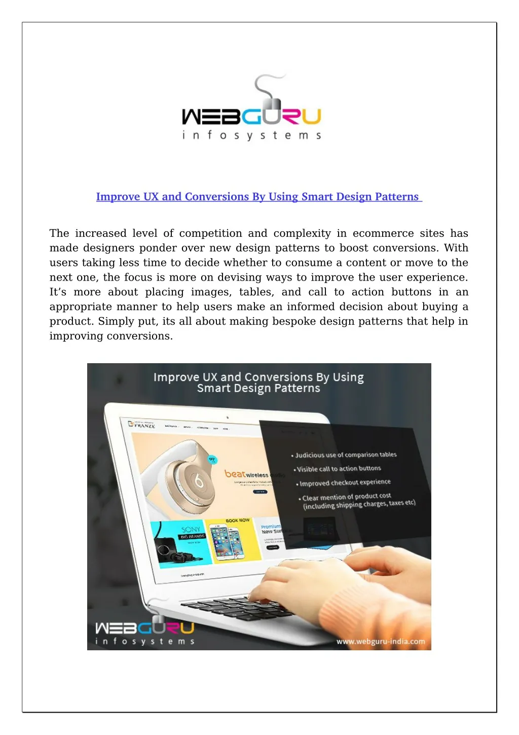
Improve UX and Conversions By Using Smart Design Patterns Improve UX and Conversions By Using Smart Design Patterns The increased level of competition and complexity in ecommerce sites has made designers ponder over new design patterns to boost conversions. With users taking less time to decide whether to consume a content or move to the next one, the focus is more on devising ways to improve the user experience. It’s more about placing images, tables, and call to action buttons in an appropriate manner to help users make an informed decision about buying a product. Simply put, its all about making bespoke design patterns that help in improving conversions.
Design patterns that can provide a better user experience Judicious use of comparison tables • Visible call to action buttons • Improved checkout experience • Clear mention of product cost (including shipping charges, taxes etc) • Let’s discuss the above patterns in some detail. Comparison tables A common practice among users is to compare products, their types, features, and prices before deciding on buying a particular one. This can be best addressed by using comparison tables. However, the decision to use a table should depend on the type of product instead of using it for every product. For example, users looking for a mobile or refrigerator would like to compare different brands in terms of their features and prices before making an informed decision to purchase. On the other hand, users looking for say, apparels might find a comparison table distracting or even unnecessary. Comparison tables can have their unique attributes to improve the user experience. Less is more – the use of collapsible grids: If a product has a lot of features then users might feel tired while browsing through the list. Also, if the same is viewed on a mobile the number of table columns might appear as cluttered. Thus, designers should use collapsible grids to enable users to hide certain sections of the table for a better viewing experience. And to make that happen, it is better to take help from professional ecommerce website design services, for they are adept and in tune with the latest design trends. Visible headers: While browsing through a long list of products customers may lose track of the headers (product type, features etc), and have to scroll all the way up to know the same. This can be a tiring exercise and lead to a bad user experience. Instead, the comparison table should have floating headers wherein no matter how long the product list is, users would be able to readily see the headers at all times. Visible ‘call to action’ buttons
Every ecommerce page should have a visible call to action button that is identifiable by its size, colour contrast, or shape. However, designers should not place one of the important ‘call to action’ buttons like ‘load more’ or ‘see more’ at frequent intervals, for otherwise, users will get tired of having to hit them repeatedly while scrolling. So, what do you think? Do the call to action buttons help customers gain a better UX, then hire expert ecommerce developers to incorporate the same in your website. Better checkout experience This is followed by the presence of checkout options that are improved in terms of their design and visibility. For once a product is chosen the user should find it easy to reach the cart and payment section. This is where the navigability of pages comes in, which should be adequately addressed during the testing phase of the site. All costs clearly mentioned If an ecommerce store does not mention costs like shipping charges, taxes etc the same can lead to trust issues. Therefore, designers should put the total purchase cost (including the product cost, shipping charges, taxes etc) along with the probable delivery time. Conclusion Designers have their task cut out. In view of the evolving nature of customer buying preferences, the focus should be more on improving the user experience to achieve a better rate of conversion. This should be done by using a better design template and ensuring the ease of navigability - preferably by engaging an experienced ecommerce web development company. You can read the full content: https://medium.com/@WebGuruInfosystems/improve-ux-and- conversions-by-using-smart-design-patterns-914ebc492523 -------------------------- WebGuru Infosystems
Email ID: enquiry@webguru-india.com Phone No.: +91-33-40200844 Mobile No.: +91-9831159354 Visit Us: http://www.webguru-india.com Stay Connected Via: https://www.facebook.com/webguruinfosystems https://www.linkedin.com/company/webguru-infosystems-pvt--ltd- https://twitter.com/webgurutweet