Download

1 / 19
210 likes | 447 Views
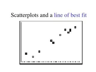
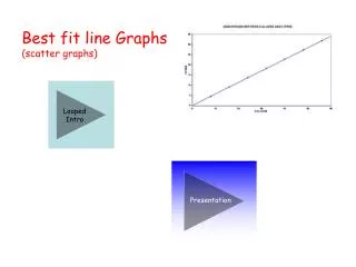
Line of Best Fit. Work with your group to make a prediction for the height at: • 21 months • 28 months • 20 years. Line of Best Fit. Definition - A Line of Best is a straight line on a Scatter plot that comes closest to all of the dots on the graph.

E N D
Work with your group to make a prediction for the height at: • 21 months • 28 months • 20 years
Line of Best Fit • Definition - A Line of Best is a straight line on a Scatter plot that comes closest to all of the dots on the graph. • A Line of Best Fit does not touch all of the dots. • A Line of Best Fit is useful because it allows us to: • Understand the type and strength of the relationship between two sets of data • Predict missing Y values for given X values, or missing X values for given Y values
Predicting Data with Scatterplots • Interpolation- Making a prediction for an unknown Y value based on a given X value within a range of known data • Extrapolation - Making a prediction for an unknown Y value based on a given X value outside of a range of known data • More accurate: Interpolation • Less accurate: Extrapolation
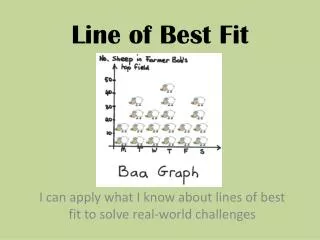
Line of Best Fit • A line of best fit is a line that best represents the data on a scatter plot. • A line of best fit may also be called a trend line since it shows us the trend of the data • The line may pass through some of the points, none of the points, or all of the points. • The purpose of the line of best fit is to show the overall trend or pattern in the data and to allow the reader to make predictions about future trends in the data.
What is Correlation? • A correlation is a relationship between two variables. • The data can be represented by the ordered pairs (x,y) where x is the independentvariable and y is the dependent variable. • Examples of variables that may be correlated: • height and shoe size • number of cigarettes smoked per day and lung capacity
Correlation Coefficient • A correlation coefficient indicates the extent to which two variables are related. • It can range from -1.0 to +1.0 • A positive correlation coefficient indicates a positive relationship, a negative coefficient indicates an negative relationship
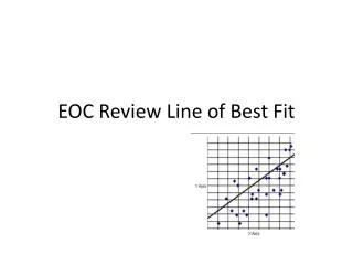
Scatter Plots and Types of Correlation x = hours of training y = number of accidents 60 50 40 30 Accidents 20 10 0 0 2 4 6 8 10 12 14 16 18 20 Hours of Training Negative Correlation–as x increases, y decreases
Scatter Plots and Types of Correlation x = height y = IQ 160 150 140 130 IQ 120 110 100 90 80 60 64 68 72 76 80 Height No linear correlation
Important Dates September 23rd: TIC Test September 26th: KA Test