Download
1 / 68
820 likes | 1.88k Views
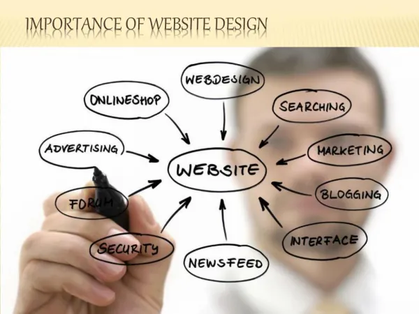
The principles of design are made up of various mixes of the elements of design all put together in one design, making our design look better. <br>Principles of design become very important for artists. They are the devices that we need to use and will unknowingly use, since they make our design look nicer and become more visually appealing to people who are looking at our work.

E N D
Importance of principles of design The principles of design are made up of various mixes of the elements of design all put together in one design, making our design look better. principles of design become very important for artists. They are the devices that we need to use and will unknowingly use, since they make our design look nicer and become more visually appealing to people who are looking at our work. That is why the principles are important, too make our artwork look visually appealing, catch people’s eyes and get good reviews.
Elements of design Line Shape • • • Size Direction •
Elements of design Texture • • • • Value Space Text
Elements of design LINE – The linear marks made with a pen or brush or the edge created when two shapes meet. SHAPE – A shape is a self contained defined area of geometric (squares and circles), or organic (free formed shapes or natural shapes). A positive shape automatically creates a negative shape.
Elements of design DIRECTION – All lines have direction – Horizontal, Vertical or Oblique. Horizontal suggests calmness, stability and tranquillity. Vertical gives a feeling of balance, formality and alertness. Oblique suggests movement and action. SIZE – Size is simply the relationship of the area occupied by one shape to that of another.
Elements of design TEXTURE – Texture is the surface quality of a shape – rough, smooth, soft hard glossy etc. COLOUR – Colour is light reflected off objects. Color has three main characteristics: hue or its name (red, green, blue, etc.), value (how light or dark it is), and intensity (how bright or dull it is).
Principles of design • Balance • Gradation • Propotion • Rhythm
Principles of design • Unity of proximity • Repetition • Contrast • Emphasis • Alignment
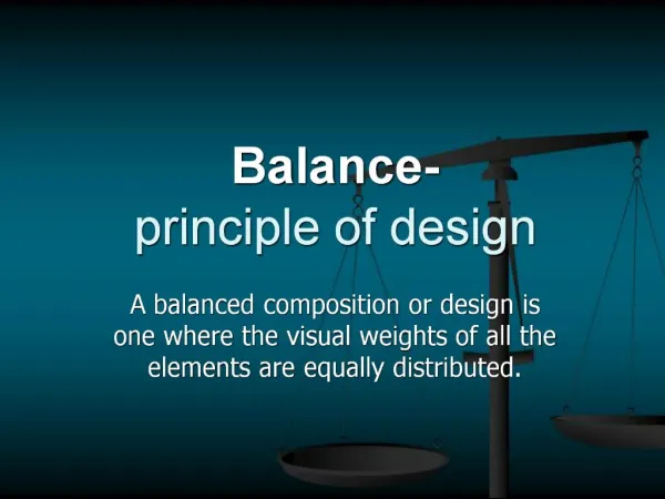
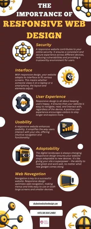
Principles of design BALANCE – Balance in design is similar to balance in physics. A large shape close to the center can be balanced by a small shape close to the edge. Balance provides stability and structure to a design PROXIMITY – Proximity creates relationship between elements. It provides a focal point. Proximity doesn’t mean that elements have to be placed together, it means they should be visually connected in someway.
Principles of design ALIGNMENT – Allows us to create order and organisation. Aligning elements allows them to create a visual connection with each other. REPETITION – Repetition strengthens a design by tying together individual elements. It helps to create association and consistency. Repetition can create rhythm (a feeling of organized movement).
Principles of design CONTRAST – Contrast is the juxtaposition of opposing elements (opposite colours on the colour wheel, or value light / dark, or direction – horizontal / vertical). Contrast allows us to emphasize or highlight key elements in your design. Proportion- refers to the relative size and scale of the various elements in a design. The issue is the relationship between objects, or parts, of a whole. This means that it is necessary to discuss proportion in terms of the context or standard used to determine proportions.
Principles of design Rhythm- can be described as timed movement through space; an easy, connected path along which the eye follows a regular arrangement of motifs. The presence of rhythm creates predictability and order in a composition. Visual rhythm may be best understood by relating it to rhythm in sound..
Principles of design Emphasis- is also referred to as point of focus, or interruption. It marks the locations in a composition which most strongly draw the viewers attention. Usually there is a primary, or main, point of emphasis, with perhaps secondary emphases in other parts of the composition.
Principles of design Gradation employs a series of motifs patterned to relate to one another through a regular progression of steps. This may be a gradation of shape or color. Some shape gradations may in fact create a sequence of events, not unlike a series of images in a comic strip.
Gestalt Theory Gestalt psychologists have come up with lists to summarize basic principles of visual perception, which have become invaluable tools for design This theory also helps the designer influence the viewer by controlling how the design is viewed.
The Key Ideas Behind Gestalt Theory •EMERGENCE (THE WHOLE IS IDENTIFIED BEFORE THE PARTS) •REIFICATION (OUR MIND FILLS IN THE GAPS) •MULTI-STABILITY (THE MIND SEEKS TO AVOID UNCERTAINTY) •INVARIANCE (WE’RE GOOD AT RECOGNIZING SIMILARITIES AND DIFFERENCES)
EMERGENCE (THE WHOLE IS IDENTIFIED BEFORE THE PARTS) Emergence is the process of forming complex patterns from simple rules. When attempting to identify an object, we first seek to identify its outline. We then match this outline pattern against shapes and objects we already know to find a match.
REIFICATION (OUR MIND FILLS IN THE GAPS) Reification is an aspect of perception in which the object as perceived contains more spatial information than what is actually present. As we attempt to match what we see to the familiar patterns we have stored in memory, there isn’t always an exact match.
MULTI-STABILITY (THE MIND SEEKS TO AVOID UNCERTAINTY) Multi-stability is the tendency of ambiguous perceptual experiences to move unstably back and forth between alternative interpretations. Some objects can be perceived in more than one way.
INVARIANCE (WE’RE GOOD AT RECOGNIZING SIMILARITIES AND DIFFERENCES) Invariance is a property of perception in which simple objects are recognized independent of their rotation, translation and scale. Since we often encounter objects from different perspectives, we’ve developed an ability to recognize them despite their different appearance.
Gestalt Principles • Law of simplicity • Closure • Symmetry and order • Figure/Ground • Uniform connectedness • Common regions • Proximity • Continuation
Gestalt Principles • Common fate • Parallelism • Similarity • Focal point • Past experiences
Proximity The principle of proximity or contiguity states that things which are closer together will be seen as belonging together.
Similarity Similarity means there is a tendency to see groups which have the same characteristics so in this example, there are three groups of black squares and three groups of white squares arranged in lines. The principle of similarity states that things which share visual characteristics such as shape, size, color, texture, value or orientation will be seen as belonging together.
Common Fate Suppose both principles of proximity and similarity are in place - then a movement takes place - the dots begin to move down the page. They appear to change grouping
Good Continuation The principle of continuity predicts the preference for continuous figures. We perceive the figure as two crossed lines instead of 4 lines meeting at the center.
Closure Related to principle of good continuation, there is a tendency to close simple figures, independent of continuity or similarity. This results in a effect of filling in missing information or organising information which is present to make a whole
Area and Symmetry The principle of area states that the smaller of two overlapping figures is perceived as figure while the larger is regarded as ground. The principle of the symmetrical figure is that it is seen as a closed figure. Symmetrical contours thus define a figure and isolate it from its ground
FIGURE/GROUND The figure/ground principle is based upon the relationship between an object and the surrounding space. Figure/ground is also referred to as positive and negative space, the positive being the object and the negative referring to the space around it.
SIMPLICITY The law of simplicity indicates that our mind perceives everything in its simplest form. The image below, for example, when studied in depth is made up of individual components that have no meaning when viewed separately, yet our mind automatically perceives them in combination to spell out the word ‘logo’.
Parallelism Elements with the same or very similar slopes are associated as a single group. When designing, we often change the inclination of our texts to match surrounding arrows or curves because it makes the entire figure look more visually compact. In this poster created to advertise the font Futura, different text areas are grouped using the principle of parallelism.
Continuity Elements are visually associated if they are aligned with each other. Lines are perceived as a single figure insofar as they’re continuous. The smoother their segments are, the more we see them as a unified shape.
Common Region When we find several elements that are part of a single region, we associate them as a single group. Consider a design for a badge where there is a combination of text, objects and a banner. All three of those elements are perceived as belonging to the unified badge.
Element Connectedness We perceive elements as being united if they are connected by other elements. An easy way to think about this principle in action is an infographic or flowchart where arrows help connect one figure (or text block) to the next.
PAST EXPERIENCES “Elements tend to be perceived according to an observer’s past experience.” Past experience is perhaps the weakest gestalt principle. In conjunction with any of the other principles, the other principle will dominate over the past experience principle.
FOCAL POINTS “Elements with a point of interest, emphasis or difference will capture and hold the viewer’s attention.” This principle suggests that our attention will be drawn toward contrast, toward the element that is unlike the others in some way. In the image below, your eye should be drawn to the square. It’s a different shape and color from the other elements
Figure-Ground Relationship Figure ground is a visual relationship between foreground and background. This is important to the perception of images, as the edges form the image that we see.
Three Distinct Types • Simple Figure Ground • Figure Ground Reversal • Figure Ground Ambiguity
Simple Figure Ground A simple figure ground is the composition (or diagram) of what is perceived. A figure ground can be anything with a main focus, but a diagrammatic figure ground simplifies perception. In architecture, the site plan is often simplified to show the relationships otherwise not perceived, such as the building's mass in comparison to its surroundings.
Figure Ground Reversal Figure ground reversal is the inversion of background and foreground. This is often used in logo designs and can often ground an image. In a simple figure ground the borders are perceived as limitless, whereas the figure ground reversal bounds the image.
Figure Ground Ambiguity Figure ground ambiguity is the visual illusion with two alternate viewpoints. This is similar to figure ground reversal, but the alternate image creates a totally different perception. In this version of figure ground, a pair of objects share a similar edge.
Space as a Design Element Space can be used to both separate and connect elements in a design. Wider spaces separate elements from each other and narrower spaces connect elements to reveal relationships between them. Overlapping elements maximizes their relationship. By controlling and shaping space in our designs, we create rhythm, direction, and motion. We create design flow through our use of space. Whitespacedoesthreemainthings in a design. • Creates groupingsofelements • Creates emphasis and hierarchy • Improves legibility
Space can be used to convey a variety of meanings, some of which include • Quality – wealth, luxury • Solitude – abandonment, loneliness • Cleanliness – bleached, washed • Purity – unsullied, unadulterated • Spirituality – sacredness, connection to something greater • Openness – distance, infinity • Calmness – placidity, inaction
How to Use Space in Design Space in web design can be divided into to types. Micro whitespace– is the space within elements, such as the marginssurroundingtextandtheleading betweenlinesoftext or the spaces between the individual characters. Macro whitespace– is the space between major elements in your design. These spaces tend to be larger and are usually immediately apparent
Micro Whitespace Microwhitespace is concerned with spaces between smaller elements. It’s space between list items and space between an image and its caption. It also includes the space between elements inside a larger element.
Macro Whitespace them from other elements or groups of elements. Boxes can be overkill. Boxes (borders and backgrounds) are often used to enclose and connect some elements while separating