Download
1 / 15
150 likes | 595 Views
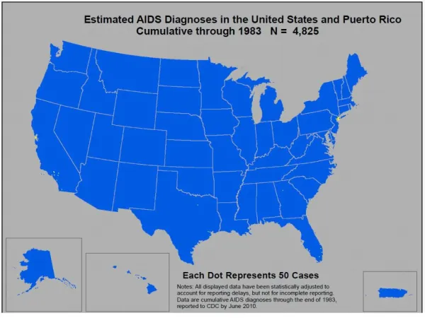
Of the various types of thematic maps, choropleth maps are the most common and easily interpreted. With a choropleth map one uses a sequence of shades, colors or patterns to assign values/classes using predefined areal units (politically-defined area or administrative units--census areas or zip codes). Here we are using dot maps, as they provide an easily understood pattern of relative AIDS density.

E N D
15. Of the various types of thematic maps, choropleth maps are the most common and easily interpreted. With a choropleth map one uses a sequence of shades, colors or patterns to assign values/classes using predefined areal units (politically-defined area or administrative units--census areas or zip codes). Here we are using dot maps, as they provide an easily understood pattern of relative AIDS density.
�
In this�series�of county-based dot-density�maps, the data used are estimated AIDS cases by county, for the 50 US states, Washington D.C. and Puerto Rico, cumulative through 2008. The mapped data excludes cases where the county of residence at AIDS diagnosis is unknown (but these cases are accounted for in the title of each map where the cumulative number is provided). The dot size and value remain constant through time; each dot represents 50 cases of AIDS by county. In other words, if by 2005 a particular county hasn�t reported more than 49 cumulative cases of AIDS, then that county would not have a dot associated with it -- it doesn�t mean that county doesn�t have any cases of AIDS, only that it doesn�t have 50 or more. Additionally, if a county has between 50 and 99 cases of AIDS, it receives 1 dot. In several areas the dots begin to coalesce as time passes.��Assigning one dot�to every 100 cases�was�considered, but�left many areas of the US�erroneously under-represented. Finally, the dots are randomly placed inside the counties.
�
Data source: HIV Incidence and Case Surveillance Branch, Division of HIV/AIDS Prevention, Centers for Disease Control and Prevention. Data have been adjusted for reporting delays. Data are presented for AIDS cases reported to CDC through June 2008. All data are provisional.