Download
1 / 40
400 likes | 456 Views
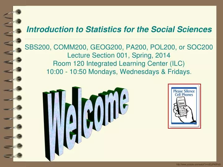
Introduction to Statistics for the Social Sciences SBS200, COMM200, GEOG200, PA200, POL200, or SOC200 Lecture Section 001, Spring, 2014 Room 120 Integrated Learning Center (ILC) 10:00 - 10:50 Mondays, Wednesdays & Fridays . Welcome. http://www.youtube.com/watch?v=oSQJP40PcGI. Please click in.

E N D
Introduction to Statistics for the Social SciencesSBS200, COMM200, GEOG200, PA200, POL200, or SOC200Lecture Section 001, Spring, 2014Room 120 Integrated Learning Center (ILC)10:00 - 10:50 Mondays, Wednesdays & Fridays. Welcome http://www.youtube.com/watch?v=oSQJP40PcGI
Please click in My last name starts with a letter somewhere between A. A – D B. E – L C. M – R D. S – Z
Use this as your study guide By the end of lecture today2/5/14 • Dot Plots • Frequency Distributions - Frequency Histograms • Frequency, relative frequency • Guidelines for constructing frequency distributions • Correlational methodology • Positive, Negative and Zero correlation
Schedule of readings Before next exam (February 14th) Please read chapters 1 - 4 in Ha & Ha textbook Please read Appendix D, E & F onlineOn syllabus this is referred to as online readings 1, 2 & 3 Please read Chapters 1, 5, 6 and 13 in Plous Chapter 1: Selective Perception Chapter 5: Plasticity Chapter 6: Effects of Question Wording and Framing Chapter 13: Anchoring and Adjustment
Lab sessions • Reminder for labs this week: • By your lab session you should have • recruited 5 people to complete the survey • input the collected data into an excel spreadsheet with the exact format as the one presented in lab(note: this format is also available on the class website) • It is important to bring an electronic version of your data to lab. You can either email it to yourself or save it on a flash drive.
Lab sessions Labs this week • Remember: • Bring electronic copy of your data (flash drive or email it to yourself) • Your data should have correct formatting • See Lab Materials link on class website to double-check formatting of excel is exactly consistent
Homework due – Friday (February 7th) On class website: please print and complete homework worksheet #5
You’ve gathered your data…what’s the best way to display it??
Describing Data Visually 8 12 14 17 19 24 8 12 14 17 20 25 9 13 15 17 20 25 10 13 15 17 20 25 11 13 16 17 20 27 11 13 16 17 21 28 11 14 16 18 21 29 11 14 16 18 22 11 14 16 18 23 11 14 16 19 24 Measuring the “frequency of occurrence”
53 58 60 61 64 69 70 72 73 75 75 76 78 80 82 84 84 84 87 87 87 88 89 91 93 94 95 99 55 - 59 75 - 79 50 - 54 60 - 64 80 - 84 95 - 99 70 - 74 85 - 89 65 - 69 90 - 94 Score on exam Scores on an exam 82 58 64 80 75 72 87 73 88 94 84 78 93 69 70 60 53 84 76 87 84 61 89 95 87 91 75 99 Remember Dot Plots Step 1: List scores Step 2: List scores in order Step 3: Decide grouped Step 4: Decide 10 for # bins (classes) 5 for bin width (interval size) Step 5: Generate frequency histogram 6 5 Scores on an exam Score Frequency 95 - 99 2 90 - 94 3 85 - 89 5 80 – 84 5 75 - 79 4 70 - 74 3 65 - 69 1 60 - 64 3 55 - 59 1 50 - 54 1 4 3 2 1
53 58 60 61 64 69 70 72 73 75 75 76 78 80 82 84 84 84 87 87 87 88 89 91 93 94 95 99 55 - 59 75 - 79 50 - 54 60 - 64 80 - 84 95 - 99 70 - 74 85 - 89 65 - 69 90 - 94 Score on exam Scores on an exam 82 58 64 80 75 72 87 73 88 94 84 78 93 69 70 60 53 84 76 87 84 61 89 95 87 91 75 99 Remember Dot Plots Step 1: List scores Step 2: List scores in order Step 3: Decide grouped Step 4: Decide 10 for # bins (classes) 5 for bin width (interval size) Step 5: Generate frequency histogram 6 5 Scores on an exam Score Frequency 95 - 99 2 90 - 94 3 85 - 89 5 80 – 84 5 75 - 79 4 70 - 74 3 65 - 69 1 60 - 64 3 55 - 59 1 50 - 54 1 4 3 2 1
53 58 60 61 64 69 70 72 73 75 75 76 78 80 82 84 84 84 87 87 87 88 89 91 93 94 95 99 55 - 59 75 - 79 50 - 54 60 - 64 80 - 84 95 - 99 70 - 74 85 - 89 65 - 69 90 - 94 Score on exam Scores on an exam 82 58 64 80 75 72 87 73 88 94 84 78 93 69 70 60 53 84 76 87 84 61 89 95 87 91 75 99 Remember Dot Plots Step 1: List scores Step 2: List scores in order Step 3: Decide grouped Step 4: Decide 10 for # bins (classes) 5 for bin width (interval size) Step 5: Generate frequency histogram 6 5 Scores on an exam Score Frequency 95 - 99 2 90 - 94 3 85 - 89 5 80 – 84 5 75 - 79 4 70 - 74 3 65 - 69 1 60 - 64 3 55 - 59 1 50 - 54 1 4 3 2 1
53 58 60 61 64 69 70 72 73 75 75 76 78 80 82 84 84 84 87 87 87 88 89 91 93 94 95 99 55 - 59 75 - 79 50 - 54 60 - 64 80 - 84 95 - 99 70 - 74 85 - 89 65 - 69 90 - 94 Score on exam Scores on an exam 82 58 64 80 75 72 87 73 88 94 84 78 93 69 70 60 53 84 76 87 84 61 89 95 87 91 75 99 Remember Dot Plots Step 1: List scores Step 2: List scores in order Step 3: Decide grouped Step 4: Decide 10 for # bins (classes) 5 for bin width (interval size) Step 5: Generate frequency histogram 6 5 Scores on an exam Score Frequency 95 - 99 2 90 - 94 3 85 - 89 5 80 – 84 5 75 - 79 4 70 - 74 3 65 - 69 1 60 - 64 3 55 - 59 1 50 - 54 1 4 3 2 1
55 - 59 75 - 79 50 - 54 60 - 64 80 - 84 95 - 99 70 - 74 85 - 89 65 - 69 90 - 94 Score on exam Scores on an exam 82 58 64 80 75 72 87 73 88 94 84 78 93 69 70 60 53 84 76 87 84 61 89 95 87 91 75 99 Step 1: List scores Step 2: List scores in order Step 3: Decide grouped Step 4: Decide 10 for # bins (classes) 5 for bin width (interval size) Step 5: Generate frequency histogram Scores on an exam Score Frequency 95 - 99 2 90 - 94 3 85 - 89 5 80 – 84 5 75 - 79 4 70 - 74 3 65 - 69 1 60 - 64 3 55 - 59 1 50 - 54 1 6 5 4 3 2 1
55 - 59 75 - 79 50 - 54 60 - 64 80 - 84 95 - 99 70 - 74 85 - 89 65 - 69 90 - 94 Score on exam Scores on an exam 82 58 64 80 75 72 87 73 88 94 84 78 93 69 70 60 53 84 76 87 84 61 89 95 87 91 75 99 Generate frequency polygon Plot midpoint of histogram intervals Connect the midpoints Scores on an exam Score Frequency 95 - 99 2 90 - 94 3 85 - 89 5 80 – 84 5 75 - 79 4 70 - 74 3 65 - 69 1 60 - 64 3 55 - 59 1 50 - 54 1 6 5 4 3 2 1
55 - 59 75 - 79 50 - 54 60 - 64 80 - 84 95 - 99 70 - 74 85 - 89 65 - 69 90 - 94 Score on exam Scores on an exam 82 58 64 80 75 72 87 73 88 94 84 78 93 69 70 60 53 84 76 87 84 61 89 95 87 91 75 99 Generate frequency ogive (“oh-jive”) Frequency ogive is used for cumulative data Plot midpoint of histogram intervals Connect the midpoints Scores on an exam Score 95 – 99 90 - 94 85 - 89 80 – 84 75 - 79 70 - 74 65 - 69 60 - 64 55 - 59 50 - 54 30 Cumulative Frequency 28 26 23 18 13 9 6 5 2 1 25 20 15 10 5
Pareto Chart: Categories are displayed in descending order of frequency
Stacked Bar Chart: Bar Height is the sum of several subtotals
Simple Line Charts: Often used for time series data (continuous data)(the space between data points implies a continuous flow) Note: For multiple variables lines can be better than bar graph Note: Fewer grid lines can be more effective Note: Can use a two-scale chart with caution
Scores on an exam 82 58 64 80 75 72 87 73 88 94 84 78 93 69 70 60 53 84 76 87 84 61 89 95 87 91 75 99 Step 6: Complete the Frequency Table Scores on an exam Score Frequency 95 - 99 2 90 - 94 3 85 - 89 5 80 – 84 5 75 - 79 4 70 - 74 3 65 - 69 1 60 - 64 3 55 - 59 1 50 - 54 1 RelativeCumulative Frequency 1.0000 .9285 .8214 .6428 .4642 .3213 .2142 .1785 .0714 .0357 Relative Frequency .0715 .1071 .1786 .1786 .1429 .1071 .0357 .1071 .0357 .0357 Cumulative Frequency 28 26 23 18 13 9 6 5 2 1 Just adding up the relative frequency data from the smallest to largest numbers Please note: Also just dividing cumulative frequency by total number 1/28 = .0357 2/28 = .0714 5/28 = .1786 6 bins Interval of 8 Just adding up the frequency data from the smallest to largest numbers Just dividing each frequency by total number to get a ratio (like a percent) Please note: 1 /28 = .0357 3/ 28 = .1071 4/28 = .1429
Scores on an exam 82 58 64 80 75 72 87 73 88 94 84 78 93 69 70 60 53 84 76 87 84 61 89 95 87 91 75 99 Where are we? Scores on an exam Score Frequency 95 - 99 2 90 - 94 3 85 - 89 5 80 – 84 5 75 - 79 4 70 - 74 3 65 - 69 1 60 - 64 3 55 - 59 1 50 - 54 1 Relative Frequency .0715 .1071 .1786 .1786 .1429 .1071 .0357 .1071 .0357 .0357 Cumulative Rel. Freq. 1.0000 .9285 .8214 .6428 .4642 .3213 .2142 .1785 .0714 .0357 Cumulative Frequency 28 26 23 18 13 9 6 5 2 1 Cumulative Frequency Data Cumulative Frequency Histogram
Simple Frequency Table – Qualitative Data We asked 100 Republicans “Who is your favorite candidate?” Number expected to vote 6,380,000 3,740,000 2,860,000 2,200,000 880,000 880,000 5,060,000 Who is your favorite candidate Candidate Frequency Rick Perry 29 Mitt Romney 17 Ron Paul 13 Michelle Bachman 10 Herman Cain 4 Newt Gingrich 4 No preference 23 Relative Frequency .2900 .1700 .1300 .1000 .0400 .0400 .2300 Percent 29% 17% 13% 10% 4% 4% 23% If 22 million Republicans voted today how many would vote for each candidate? Just divide each frequency by total number Just multiply each relative frequency by 22 million Just multiply each relative frequency by 100 Please note: 29 /100 = .2900 17 /100 = .1700 13 /100 = .1300 4 /100 = .0400 Please note: .2900 x 22m = 6,667k .1700 x 22m = 3,740k .1300 x 22m = 2,860k .0400 x 22m= 880k Please note: .2900 x 100 = 29% .1700 x 100 = 17% .1300 x 100 = 13% .0400 x 100 = 4% Data based on Gallup poll on 8/24/11
Pie Charts: General idea of data that must sum to a total(these are problematic and overly used – use with much caution) Exploded 3-D pie charts look cool but a simple 2-D chart may be more clear Exploded 3-D pie charts look cool but a simple 2-D chart may be more clear Bar Charts can often be more effective
Designed our study / observation / questionnaire Collected our data Organize and present our results
Scatterplot displays relationships between two continuous variables Correlation: Measure of how two variables co-occur and also can be used for prediction Range between -1 and +1 The closer to zero the weaker the relationship and the worse the prediction Positive or negative
Correlation Range between -1 and +1 +1.00 perfect relationship = perfect predictor +0.80 strong relationship = good predictor +0.20 weak relationship = poor predictor 0 no relationship = very poor predictor -0.20 weak relationship = poor predictor -0.80 strong relationship = good predictor -1.00 perfect relationship = perfect predictor
Positive correlation: as values on one variable go up, so do values for the other variable Negative correlation: as values on one variable go up, the values for the other variable go down Height of Mothers by Height of Daughters Height ofMothers Positive Correlation Height of Daughters
Positive correlation: as values on one variable go up, so do values for the other variable Negative correlation: as values on one variable go up, the values for the other variable go down Brushing teeth by number cavities BrushingTeeth Negative Correlation NumberCavities
Perfect correlation = +1.00 or -1.00 One variable perfectly predicts the other Height in inches and height in feet Speed (mph) and time to finish race Positive correlation Negative correlation
Correlation The more closely the dots approximate a straight line,(the less spread out they are) the stronger the relationship is. Perfect correlation = +1.00 or -1.00 One variable perfectly predicts the other No variability in the scatterplot The dots approximate a straight line
Correlation does not imply causation Is it possible that they are causally related? Yes, but the correlational analysis does not answer that question What if it’s a perfect correlation – isn’t that causal? No, it feels more compelling, but is neutral about causality Number of Birthdays Number of Birthday Cakes
Positive correlation: as values on one variable go up, so do values for other variable Negative correlation: as values on one variable go up, the values for other variable go down Number of bathrooms in a city and number of crimes committed Positive correlation Positive correlation
Linear vs curvilinear relationship Linear relationship is a relationship that can be described best with a straight line Curvilinear relationship is a relationship that can be described best with a curved line
Correlation - How do numerical values change? http://neyman.stat.uiuc.edu/~stat100/cuwu/Games.html http://argyll.epsb.ca/jreed/math9/strand4/scatterPlot.htm Let’s estimate the correlation coefficient for each of the following r = +.80 r = +1.0 r = -1.0 r = -.50 r = 0.0
Correlation - How do numerical values change? r = +0.97 r = -0.48 r = 0.61 r = -0.91
Thank you! See you next time!!