Download
1 / 72
720 likes | 803 Views
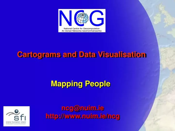
Cartograms and Data Visualisation. Mapping People. ncg@nuim.ie http://www.nuim.ie/ncg. Outline. Map Projections Cartograms Population Cartogram of Ireland Population Change. Map Projections. A problem with maps arises because the earth is roughly spherical and maps are variously

E N D
Cartograms and Data Visualisation Mapping People ncg@nuim.ie http://www.nuim.ie/ncg
Outline • Map Projections • Cartograms • Population Cartogram of Ireland • Population Change
Map Projections • A problem with maps arises because the earth is roughly spherical and maps are variously • printed on flat sheets of paper • bound into books for convenience of use • viewed on flat computer displays
Projections • We therefore need some means of representing the 3-d nature of the Earth in two dimensions • We might not need to represent the whole earth • This is where map projections come in
Whole-Earth Projections • There are hundreds of different map projections • Usually named after their creator or method of construction • Each has different properties…
Projection properties • Relationships between areas are preserved (‘equal area’ projections) • Relationships between angles are preserved (‘conformal’ projections) • Some distance relationships are preserved
Projections: uses • Navigation • Lineof constant bearing is a straight line on Mercator’s projection • Representing continents • Lambert’s conformal conic projection is used to represent maps by the EU • Representing countries • Relates to the extent of country (eg RoI and UK choose a transverse cylindrical projection)
Projections: uses • Political • Peters’ Projection from 1973 claimed to represent the areas of the countries more truly than ‘Imperialistic’ Mercator projection • (Although Gall came up with the same projection in 16xx!)
Places not people • People tend not to spread themselves uniformly across land areas • They tend to live where it’s more convenient to do so (lowland areas, near rivers, near raw materials) • They’re also gregarious – live in settlements • They don’t usually live in the middle of deserts or tundra
Showing people • We’re so used to thinking in terms of the physical or political earth that we forget about the social earth. • Our maps represent physical or administrative features (roads, trees, rivers, buildings) but not people
Showing people • Showing the results of an election or incidence of a disease presents a problem • In areas of high population density the physical size of the zones to be mapped is often small • Large rural areas with low populations dominate the visual effect and give us a misleading impression of the underlying spatial pattern
People based maps • Can we, therefore, come up with a map projection in which the sizes of the zones are in proportion to the number of people than live in them? • Yes… they’re known as • Value-by-area maps • Density-equalising maps • Cartograms
Albers’ conic projection Population based cartogram Voting in the 2000 US Presidential election – proportion voting for each candidate [Gastner & Newman: 2004]
Lung cancer in males in New York State [Gastner & Newman: 2004] If we plot the locations of lung cancer cases, we obtain a map which follows the underlying population distribution – there appears to be “clusters” (but these are spurious!) However, if we use a map based on equal population density we see that the incidence of lung cancer is randomly spatially distributed
Joseph R. Grundy, Pennsylvania manufacturer, suggested in the Senate lobby committee that the present equal power of States in voting on tariff bills is unfair because of differences in voting strength. Here's a map of the United States showing the size of each State on the basis of population and Federal Taxes. Washington Post November 3, 1929. [Tobler: 2004]
Dorling: c1990 Levasseur: 1870
Creating cartograms • In the late 1950s the US geographer Waldo Tobler became interested in the possibilities of using computers to carry out the calculations for cartograms • His PhD ‘Map Transformations of Geographic Space’ appeared in 1961
But… • The process is rather complex and many solutions have been proposed among them: • Tobler (1961) • slow , but prone to topological errors • Dougenik, Chris & Niemeyer (1985) • faster, but still prone to error • Dorling (1996) • based on cellular automata: unaesthetic results • Kocmoud (1997) • “prohibitively slow”
Gastner & Newman • Recently Michael Gastner and Michael Newman, both physicists, proposed another solution based on diffusion • Like Dorling’s method it allows regions to ‘trade their area until a fair distribution is reached’ • However it is not tied to an underlying lattice – results don’t look “blocky”
Software • Gaster and Newman’s C code is available for download from their website • It can be compiled and run on a desktop/laptop PC… • … or something more powerful
Irish Cartogram • We use Garstner and Newman’s method to produce a density-equalized map of Irish counties • The starting point is a list of coordinates for each county boundary in the Irish National Grid system… • … and the populations of each county
Time required… • The software runs quite quickly… • There are 14000 coordinates for the counties of Ireland in the data I’m using • Takes about 2 minutes to run on a Dell 270
Maps Compared Unemployment Rate: 2002
Spaces • We’ll refer to the original map as showing ‘physical space’ • We’ll refer to the transformed coordinates as being in ‘cartogram space’ • GIS software allows us to transform other data between these spaces
Rubbersheeting • The transformation process is known colloquially as rubbersheeting • We need a set of vectors… • The next maps show the displacement vectors for the ‘centroids’ of each county
Changing Population • We can use the county populations from previous Censuses to examine the effects of population change • 1841 • 1926 • 1961 - 2002
Population Scaling • The previous cartograms show how the segments of the Irish ‘cake’ are redistributed according the changes in population • Using GIS we can scale the cartograms so that the land area is in proportion to the total population in each year