Download
1 / 27
340 likes | 720 Views
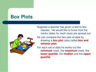
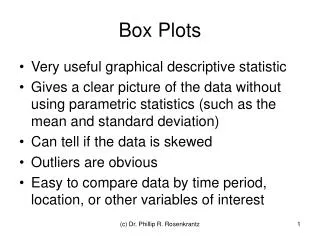
Five Number Summary and Box Plots. Please view this tutorial and answer the follow-up questions on loose leaf to be handed into your teacher. Five Number Summary and Box Plot Basics. The Five Number Summary consists of the minimum, lower quartile (Q1), median, upper quartile (Q3), and maximum.

E N D
Five Number Summary and Box Plots Please view this tutorial and answer the follow-up questions on loose leaf to be handed into your teacher.
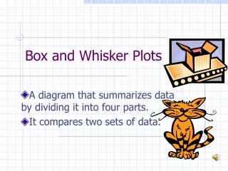
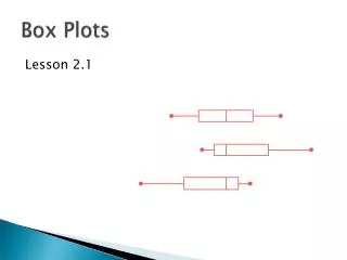
Five Number Summary and Box Plot Basics • The Five Number Summary consists of the minimum, lower quartile (Q1), median, upper quartile (Q3), and maximum. • It is used to determine the variability (or the differences in data) of a data set and to construct box plots. • Box plots are used as a visual representation of the data.
Five Number Summary Definitions • Minimum: the smallest value in a data set • Lower quartile (Q1): the 25th percentile; 25% of the information is less than this value • Median: the 50th percentile or middle value • Upper quartile (Q3): the 75th percentile; 75% of the information is less than this value • Maximum: the largest value in a data set
Example Next, you’ll break up this information into quarters. There will be the same amount of numbers in each section.
Example First, find the middle number. Since this list has 13 values, the middle number would be the 7th number. Note: If there was an even amount of values, you would find the average of the two middle numbers.
Example Now that you have your halfway point, find the middle of the top and bottom sections. There are six values in the top section so the middle value would fall between the 3rd and 4th values. Find the middle value for the bottom section.
Example The middle value would fall between the 10th and 11th values. Now that we have our intervals set up, we can find the values for our five number summary.
Example The minimum is 5. To find the lower quartile (Q1), find the average of 7 and 8. Q1 is 7.5. The median, or middle value is 10. To find the upper quartile (Q3), find the average of 18 and 19. Q is 18.5. The maximum is 24.
Example You would write the five number summary for this data set as follows: minimum= 5 Q1 = 7.5 median= 10 Q3 = 18.5 maximum= 24
Five Number Summary on the Calculator To find the five number summary on the calculator, first you need to enter your information into a list then quit.
Five Number Summary on the Calculator Next, hit STAT then go over to CALC then to 1:1VarStats( then hit Enter.
Five Number Summary on the Calculator Tell the calculator where your information is (ex. L1) then hit ENTER Scroll down to see the five number summary.
Making a Box Plot Using the five number summary, you can easily construct a box plot. minimum= 5 Q1 = 7.5 median= 10 Q3 = 18.5 maximum= 24 First, we need to make a number line. Choose your minimum, maximum and scale based on your five number summary. Our minimum is 5 and maximum is 24. What should we choose as our minimum, maximum and scale for our number line?
Making a Box Plot 0 would be a good choice for our minimum, 25 for our maximum with a scale of 5. minimum= 5 Q1 = 7.5 median= 10 Q3 = 18.5 maximum= 24 Next, we need to mark off the values for each number in the five number summary. 5 0 10 15 20 25
Making a Box Plot Make a small tick mark for the minimum and maximum. minimum= 5 Q1 = 7.5 median= 10 Q3 = 18.5 maximum= 24 Make larger tick marks for Q1, median, and Q3. 5 0 10 15 20 25
Making a Box Plot Connect the longer tick marks with two lines to form a box. minimum= 5 Q1 = 7.5 median= 10 Q3 = 18.5 maximum= 24 Connect the smaller tick marks with lines to the center of the box. 5 0 10 15 20 25
Describing a Box Plot In a box plot, each segment represents 25% of the information. minimum= 5 Q1 = 7.5 median= 10 Q3 = 18.5 maximum= 24 25% 25% 25% 25% What can you tell about the way the information is grouped based on this histogram? 5 0 10 15 20 25
Describing a Box Plot Intervals that are smaller (like from the minimum to Q1) have information that is tightly packed together. minimum= 5 Q1 = 7.5 median= 10 Q3 = 18.5 maximum= 24 25% 25% 25% 25% Intervals that are larger (like from the median to Q3) have information that is more spread out. 5 0 10 15 20 25
Describing a Box Plot The length of the box (from Q1 to Q3) represents the IQR, or interquartile range. This is the middle 50% of the data. minimum= 5 Q1 = 7.5 median= 10 Q3 = 18.5 maximum= 24 50% This value will help you determine the variability of a data set or to compare variability of more than one set of data. 5 0 10 15 20 25
Describing a Box Plot The larger the IQR, the larger the variability of the data set. The smaller the IQR, the smaller the variability. The IQR for this box plot is 11 (Q3-Q1). minimum= 5 Q1 = 7.5 median= 10 Q3 = 18.5 maximum= 24 50% You can also look at the length of the box to help determine the variability of the data. 5 0 10 15 20 25
Describing a Box Plot So along with the five number summary, you can also talk about whether the box plot is skewed or symmetric based on the size of each interval. minimum= 5 Q1 = 7.5 median= 10 Q3 = 18.5 maximum= 24 Do you think this box plot is skewed right, skewed left, or symmetric? 5 0 10 15 20 25
Describing a Box Plot This box plot is skewed to the right because the intervals between the median and Q3 and the interval between Q3 and the maximum are very spread out. Sometimes it helps to compare the box plot to a histogram to determine the skewness of the plot. 5 0 10 15 20 25
Describing a Box Plot Notice that the histogram is skewed to the right (the tail is on the right). 5 5 0 0 10 10 15 15 20 20 25 25
Describing a Box Plot Here is the correct description of this box plot. minimum= 5 Q1 = 7.5 median= 10 Q3 = 18.5 maximum= 24 IQR = 11 range = 19 skewed to the right 5 0 10 15 20 25
Follow Up Questions Answer the following questions on loose leaf and hand them in to your teacher.
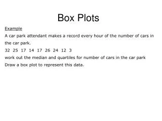
The following are scores from 25 students on a unit test in mathematics. Find the five number summary for this data set. Find the interquartile range (IQR). Make a box plot for this information. Describe the distribution.
About what percentage of students scored between 70 and 90 on the test depicted in the box plot above? • 40 • 50 • 75 • 90 • Cannot be determined from the information given 100 50 60 70 80 90